Project 4: Personal Portfolio

See the final portfolio

Thoughts on the project.

The goal of this portfolio was to create home for my work that reflects both my own personal style as well as the styles of client that I am trying to reach.

Through the project the guiding stylistic principal was minimalism. My site map is only one level deep and 4 nodes wide, the home page exposes all of those options without being overwhelming. My color palette consists of two colors off black and off white. I intentionally only have three projects listed, I did this because I wanted the user to feel like they should take the time to look at each project rather than just simply scroll through a huge list of them. I tried to use minimal amounts of text in comfortable line widths with lots of images to break up the space, almost like a children's book but for people that want to hire me.

For my secondary pages I wanted to maintain a consistent look and feel. The headings, links, paragraphs etc. remain the same from one page to the next. Another thing I did on each of these pages is introduce them with a full height image. I think that by doing this I am achieving my goal of creating a modern feel that highlights the work. I really like working with a uniform style like this because it makes it easier for the user to adapt to my layout and appreciate my content.

Perhaps the greatest challenge was in the early stages of the design process, I really struggled to strike a balance between too conventional and too off the wall, usually leaning too far in the conventional direction. I also sometimes find myself wanting to delve too far into a design rather than just starting over making 5 new ones and coming back to it if I like it. For this project more than anything else I’ve done in this class I was able to tackle this challenge, I created about 10-20 versions on paper/in my mind and iterated on about 8 of them until I had a design in sketch that is very similar to the finished project you see before you.

Overall I am very happy with the site, as I continue to develop on it I will add more microinteractions and improve on the ones I already have.

Project 3: Spotify Go

Thoughts on the project.

Spotify Go is the result of a school project in which I needed to reimagine a music streaming service. One of the main reasons I chose Spotify is because it is a service I frequently use, for approximately 85,000 minutes a year, and because they have a strong set of brand guidelines to reference.

The premise of the project was to redesign a music streaming service with a user persona in mind. In this case my persona was Gabe Lewis, an outdoorsy college student that seeks to spend as much time doing the things he loves as possible without leaving his music behind. As Gabe is an extremely busy person he doesn't have time to always get the right music set up for each of his activities. The goal of Spotify Go is to come up with 5 playlists based upon broad categories of Gape’s activities that can be controlled quickly and easily.

One of the main focuses of my development of the application designs and the site that showcases the design was to maintain Spotify Branding. I chose you use the Spotify logo accompanied by the word GO as a logo for the app as I wanted to keep a consistent look to the branding, also I hated the logos I attempted to make myself. If there’s anything I’ve learned from this project it’s that I am definitely not a qualified to be a logo designer, yet at least.

Truthfully the biggest challenge for me was to deliver on a tight time frame. As a designer I usually seek out excessive of inspiration and prefer to iterate on my design many times particularly with school projects, however with turnaround times often as short as two days I had to adapt, I tried my hardest to do so but truthfully I came up short more than once over the course of this project.

If I were to try to do this project again I’d want to do it with fewer outside distractions so I could really focus on the task at hand.

Human Centerd design information. Download the Spotify Go Design Project PDF

Project 2: Human Centered Design

About the project

For this project my challenge was to implement human centered design to redesign a music streaming service for a specific individual. In this case the individual was my friend Gabe, or a likely non existent individual that personified Gabe’s likes, dislikes, motivations and goals.

The first thing I did was interview Gabe first about who he is as a person and secondly about his prefered music streaming service, in this case, Spotify. After learning more about Gabe and his experiences with Spotify I crafted a persona for him. My persona for Gabe is an outdoorsy college student that needs a simple no hassle experience wherever he goes.

The second step in this project was to take that persona and generate the Information Architecture of the app as they would use it. I decided to frontload the app experience so it would be ultra streamlined once it was installed and running. The first thing I would have Gabe do is enter his activities and some other information about himself. The app would then generate playlists for him based upon his activities using Artificial Intelligence, the playlists will be close to Gabe’s music tastes and Gabe will then like and dislike songs to hone the playlists in to his tastes. Once this initial step is completed the rest of the experience is just selecting playlists and merging playlists with friends.

Next I started sketching the interface, my initial sketch shows 4 premade playlists for Gabe’s activities and suggests more music below, I decided not to stick with this interface as you will see.

The fourth step was onboarding Gabe. I wanted to ensure the experience matched the visually minimal tone of the rest of the app and Informed gabe what he needed to do. The only part of the onboarding I omitted was the page where Gabe entered his interests. Admittedly it was probably the hardest part of the onboarding and I attempted to create this page many times with no luck so I decided to leave it out of the onboarding and leave it as an intermediate step between the onboarding and the home page.

Penultimately I mocked up the user interaction with the buttonless music control, since Gabe will want quickness and simplicity I decided that removing buttons in favor of a gesture based interface would be best. The goal in doing this was inspired by offroading vehicles that have fewer and larger controls on the dash to make them easier to operate with gloves and when on rough terrain.

Finally, the home page, this homepage design is a radical departure from my initial designs as it is far more minimal than my other designs which focused primarily on showing gabe his playlists and new music, album covers included. For reasons mentioned in the last paragraph I feel this design is superior, at least for Gabe’s needs, to any other music app on the market thanks to its ease of use and direct lines to other playlists.

Human Centerd design information. Download the Human Centered Design Project PDF
After Thoughts

If I were to do this project again I would not rush the sketching and seek far more inspiration before I start working on the designs. I am happy though that on this project an interface spoke to me even though I did not initially see it during the sketching phase.

Project 1: Spotify Brand Audit

About this project

The goal of this project is to pick apart a brand try to find out how their user interface informs their user experience and how those two engage their targeted audience, do they do this well?

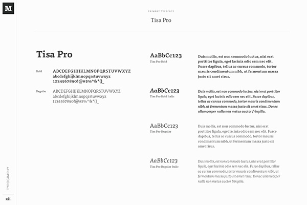
In this brand audit I attempted to answer all those questions about Spotify, one of the premiere music streaming services at the moment. Below are two great examples of pages from a brand style guide similar to what I was trying to create.

I started by just gathering colors, fonts, font sizes, etc. from the spotify web app but for every one bit of information I found I found about 3 others that I thought were important to include as well. However I did not want to get in a quantity vs quality situation. I decided to go with less elements and ensure that I included as much detail about each one as possible. This process ultimately manifested itself into the brand audit you see below. I feel that with the information I have brought together a team of designers unfamiliar with Spotify would have at least a basic idea of how the content is shaped and what it like to interact with it.

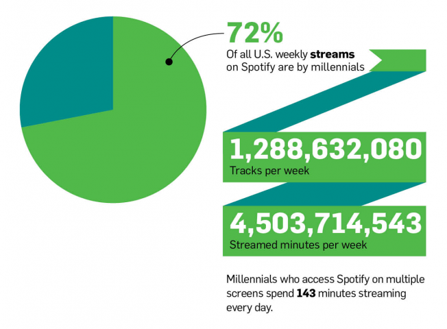
One of the greatest challenges of this project was the lack of concrete user data from spotify. I was able to find some information about general ages and listening habits of Spotify users which suggested millenials more than younger or older generations have Spotify accounts and they make up a disproportionately large amount of streaming for their group size. However beyond that information there wasn’t much in the way of location, income or education statistics.

I found this project to be quite challenging for a variety of reasons. Primarily there was an overwhelming amount of information to try to tie into a clear and concise brand audit. It was a massive struggle to try to determine what microinteractions were important to consider and which could be ignored, what characteristics of an image were pertinent and what would be too obvious to mention. I did however have fun doing some research on the users and trying to put the puzzle pieces together with Spotify’s marketing and UI to determine their target user.

Overall this project has taught me how to delve even further into the bones of a website and really look for the similarities between elements, the efficiencies in the design and of course the themes of the content.

Part 1: Gather

Collect data in the form of images, screenshots, and text, which clearly outlines Spotify's external branding collateral and user data.

spotify brand audit. Download the brand audit PDF.

Part 2: Synthesize Data

External Branding

Spotify has an extremely well defined brand. There is absolutely no confusion for the users as to what is Spotify and what is not, they have achieved this via the usage of a limited color palette, limited fonts, strict image and logo guidelines and a consistent textual message. Spotify has also made it a point to use their proprietary imagery across all their social media platforms to create a well curated and consistent brand identity that carries into their applications. This ubiquity increases ease of use when they onboard a new user from social media because they are already familiar with the brand.

Users

Spotify targets Millennials as their main demographic, the reason they do that is that Millennials account for the largest intersection of the users with disposable income and the technical skills to use their product. Another reason Spotify seems to be targeting Millennials is that they are always offering promotions to attempt to reel in new users as premium subscribers. Millenials are very comfortable with subscription based services more than any other generation.

Synthesis

Spotify is after the younger crowd, it would be far too much work to attempt to integrate the analog generations into a totally digital environment due to the costs of educating the user. One of the main sources that backs this claim is that the user interface, although not over complicated, can be a bit overwhelming at first. Spotify Clearly is concerned with providing as much functionality to their services as possible even if it comes at the cost of being extremely simple to learn. Spotify also does as much as they possibly can to keep things consistent but not boring. For example all of the images they use throughout the site are in the same vein but they are also processed in unique ways that distinguish one image from the next which offers visual context to the auditory content. Another key element to Spotify’s strategy is offering almost free premium trials which bring new users into their system. Once users have overcome the UI learning curve and started using the service it is almost not worth going to another platform as they would have to relearn an entirely new system.

Overall it is clear that every single element of the Spotify brand have been meticulously planned to work together for the goal of designed functionality over ease of use.

About Design for the Web

This course covers the process of designing professional web sites. It includes: creating personas to understand the audience, brand audits to clarify the messaging and tone, mood boards to establish the essence of the communication, comparison research to map out the competitive landscape, information architecture (IA) to organize the content, wire framing to visualize the entire web site, user-testing, prototyping, and user interface design (UI). A successful web design is a research-oriented, process-driven, user-centric endeavor.